
Design styles
One template, multiple styles
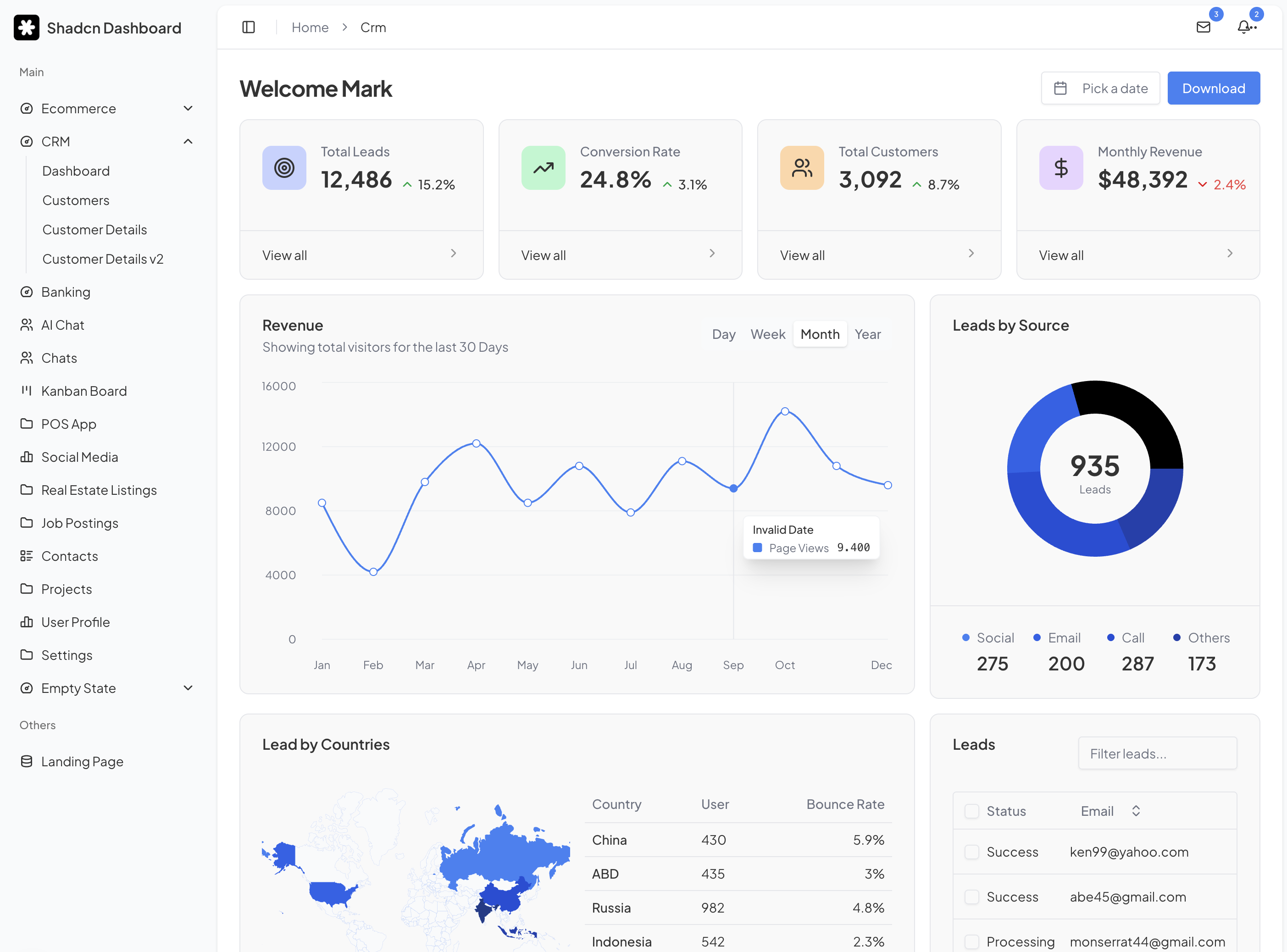
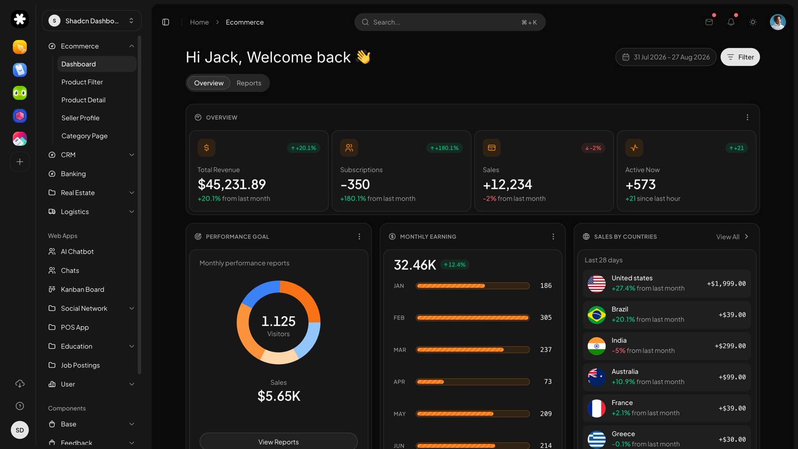
Every style restyles the same components, pages and blocks through design tokens. Pick the look that fits your product. The code underneath stays identical.
Mono
DefaultQuiet, monochrome and content-first
The default style of Shadcn UI Dashboard. A neutral grayscale palette, high-contrast typography and hairline borders keep the interface out of the way, so your data does the talking. Every component, page and block ships in this style today, in light and dark.
Aurora
Coming soonVivid gradients with a soft glow
A colorful take on the same components: gradient accents, tinted surfaces and expressive charts for products that want more personality. Built on the exact same tokens, so switching styles is a theme swap, not a rewrite.
Terra
Coming soonWarm, earthy and easy on the eyes
Muted warm neutrals, generous radii and softer shadows for calm, long-session tools like CRMs and support desks. Ships with its own chart palette tuned for readability in both themes.