About Form Layouts Blocks
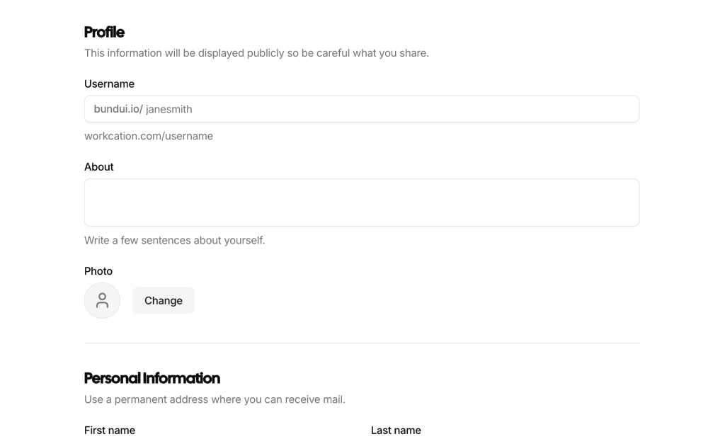
Form layout blocks are shadcn blocks that structure multi-field forms: labels, inputs, validation states, and submit actions. Built with React and TypeScript, they use shadcn/ui form components (Input, Label, Button, etc.) and Tailwind CSS for spacing and alignment. Each block gives you a ready-made form layout so you can focus on validation and submission logic.
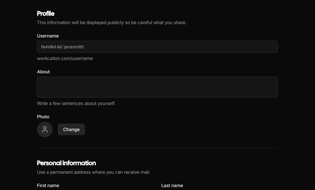
They suit settings pages, onboarding flows, contact forms, and dashboard CRUD views. Use them in Next.js or React apps wherever you need consistent, accessible form structure. They work with the shadcn form primitives and support light and dark themes so they fit your design system.
Fields, labels, and placeholders are in your code. Tailwind controls grid, gaps, and responsive columns. You can add or remove fields, switch to multi-step, or restyle inputs and buttons; the underlying shadcn UI and TypeScript structure stay the same so you keep full control and accessibility.