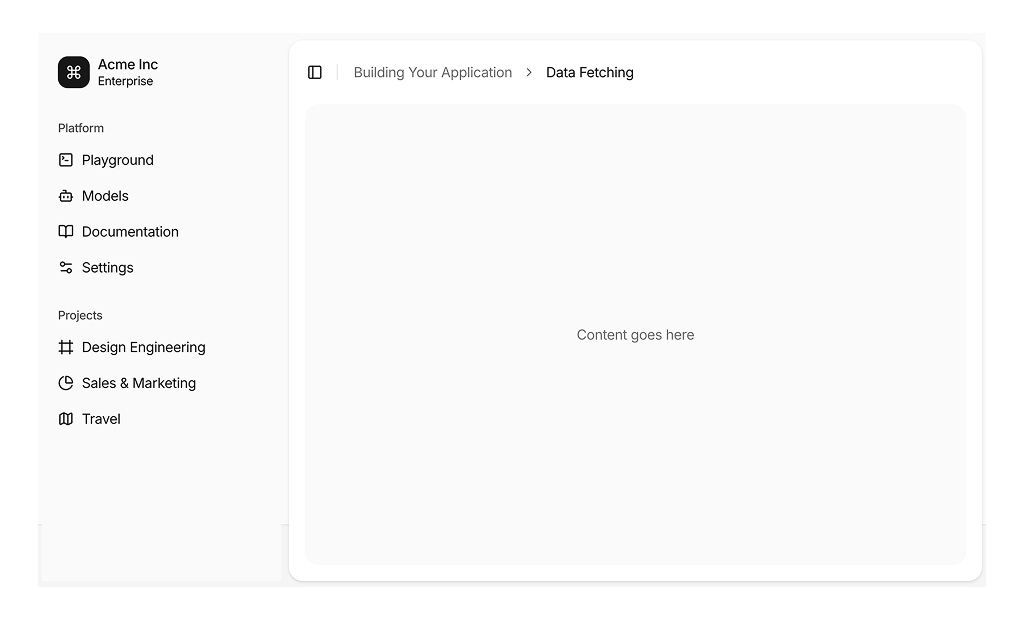
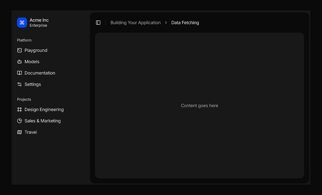
About Page Layouts Blocks
Page layout blocks are shadcn blocks that define a full page structure: header, main content area, and optional sidebar or footer. Built with React and TypeScript, they use shadcn/ui layout primitives and Tailwind CSS for grid and spacing. Each block gives you a consistent shell for dashboards, admin panels, or internal tools so you can drop in content without redefining the frame.
They are for app layouts in Next.js or React: dashboard home, settings, list and detail views. Use one layout per route or section; header and sidebar can hold nav, breadcrumbs, or user menu. They work with sidebar layout blocks and support responsive behavior and light and dark themes.
Header content, nav items, and main slot are editable. Tailwind controls columns, gaps, and breakpoints. You can add a second sidebar, change header height, or make the sidebar collapsible; the layout structure stays consistent with shadcn UI so you keep full control.